The Hidden Art Behind High-Quality Video
When you watch a truly stunning video—whether it’s an advert, a brand story, or a product launch—it’s easy to assume the magic comes from a top-of-the-range camera and some great lighting. And while those things do help, the secret to great-looking video lies in what happens after the camera stops rolling.
Behind every professional video is a carefully crafted filming and post-production process. From colour correction to grading, from white balance to audio design—each step plays a crucial role in delivering a polished final product. One essential tool we use at Square Daisy to keep everything looking its best is the Calibrite Colour Checker.
Colour Correction and Colour Grading: The Secret Sauce
Before any video reaches your screen, it goes through two vital stages: colour correction and colour grading.
- Colour correction fixes the footage. It’s where we make sure the colours are true to life—skin tones look natural, whites look white, and shadows and highlights sit where they should. It ensures consistency from one shot to the next.
- Colour grading is where the creativity kicks in. Once the footage is technically accurate, we enhance it—adding warmth, coolness, or contrast to create a certain mood or visual style. It’s what gives a film its emotional punch or a brand video its polished feel.
Skip these steps, and your footage can look flat, mismatched, or unprofessional—no matter how good the camera was.
White Balance: The Unsung Hero of Any Shoot
Of all the things we check before hitting record, white balance is one of the most important. It ensures that colours appear accurately on screen. If white balance is off, everything else will be too—you’ll get white shirts that look yellow, grey walls that look blue, and people who appear washed out or overly warm.
White balance can be affected by:
- The type of lighting (daylight, LEDs, fluorescents)
- Time of day and weather (especially when shooting outside)
- Mixed light sources in one room
- The colour of nearby surfaces reflecting light
This is why setting it correctly is so vital. If white balance is off, even great footage can look… off.
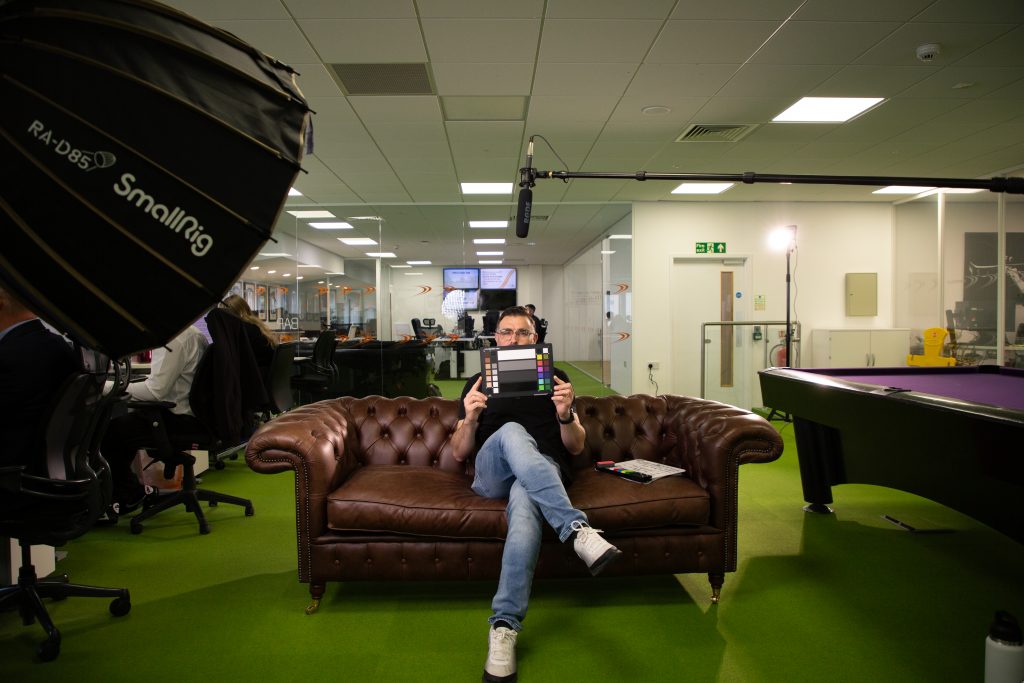
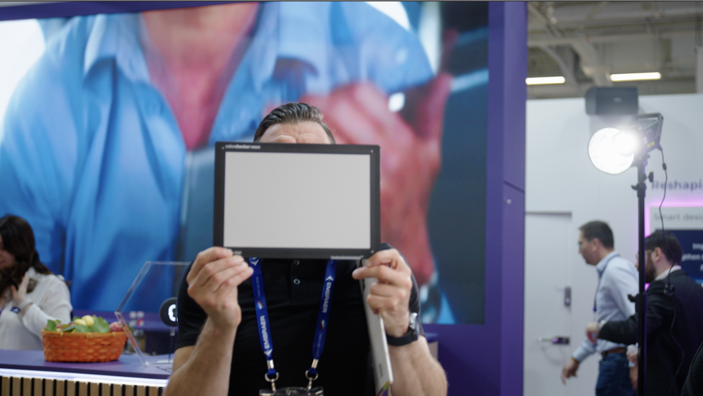
The Calibrite Colour Checker: The Most Important Thing You’ll Never See On Screen
To make sure our colours look right and stay consistent throughout a video, we use the Calibrite Colour Checker – a special chart we film at the start of every shoot.
It might not look like much, but it makes a huge difference. Here’s what it does:
The Colour Side?
This side shows a range of carefully selected colours—including natural skin tones, greys, blacks, and bold primaries. We film this card in the same lighting we’ll use for the rest of the shoot. Later, in the edit, we can compare every frame to these known values, and adjust the footage until it matches.
Why does that matter??
Imagine filming an interview across two days. Day one is sunny. Day two is cloudy. Without a colour reference, the person’s skin tone might look noticeably different between scenes. With this card, we can match both days perfectly, so your viewer never notices a change.
The Grey/White Balance Side
This side is all about getting the camera settings right before we even press record. Using the neutral grey and white squares, we set the camera to interpret colours accurately under the lighting conditions on set—whether that’s a big bright window or warm overhead lights.
Why’s that important?
Because if the white balance is off, everything else will be too—white walls can look blue, skin tones can look orange, and your brand colours won’t match reality.
In short, this card helps us lock in accuracy and consistency from the beginning. No guesswork. No nasty surprises in the edit.
Summary: Why It All Matters
Not setting the right white balance, skipping colour correction, or ignoring colour grading can ruin an otherwise great shoot. Footage may come out looking unnatural, inconsistent, or simply “not right.” And in a world where audiences expect top-quality video, that reflects badly on your brand.
At Square Daisy, we focus on these finer details so that you don’t have to. We use professional tools, robust workflows, and decades of experience to make sure that every frame looks exactly as it should. Because when your video looks good, so do you.